
Applying for a visa often feels like translating a language no one ever taught. Forms ask for details that may seem unclear, and one small mistake can lead to delays or rejection. When people move to visa apps, they expect clarity, but the experience can still feel confusing. The UI and UX should be designed properly because users need clear instructions and accurate validation at each step.
The system must reduce cognitive load and should guide users through structured flows with minimal effort. It should use OCR and auto-fill to capture data correctly and may show progress indicators to build confidence. A well-designed flow quietly prevents errors and gradually turns a complex process into something manageable.
Over the years, we’ve developed multiple visa automation solutions powered by AI-driven document intelligence and workflow orchestration systems. As we have this expertise, we’re sharing this blog to discuss how to design UI and UX for apps like Atlys.
Why Is Demand for Visa Apps Surging Globally?
According to Research And Markets, the Global E-Visa Market, valued at USD 2.31 billion in 2024, is projected to reach USD 4.30 billion by 2030 with a CAGR of 10.92%. This growth signals a shift toward digital border infrastructure.
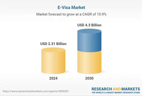
Source: Research And Markets
For investors, this represents a move from paper systems to consolidated digital platforms. As globalization resumes, traditional immigration friction has become a bottleneck. Modern travelers will not tolerate logistical opacity. This creates a vacuum for platforms prioritizing automation and data sovereignty.
Rise In Digital-First Travel
Digital nomads and a decentralized workforce have increased demand for long-stay visas. These users manage their lives via mobile. To them, physical consulate visits are a deterrent to economic activity.
Investors must target the “now” economy. Users expect real-time updates and biometric integration. A successful platform must mirror fintech apps. If capital moves in seconds, travel rights should follow with similar velocity.
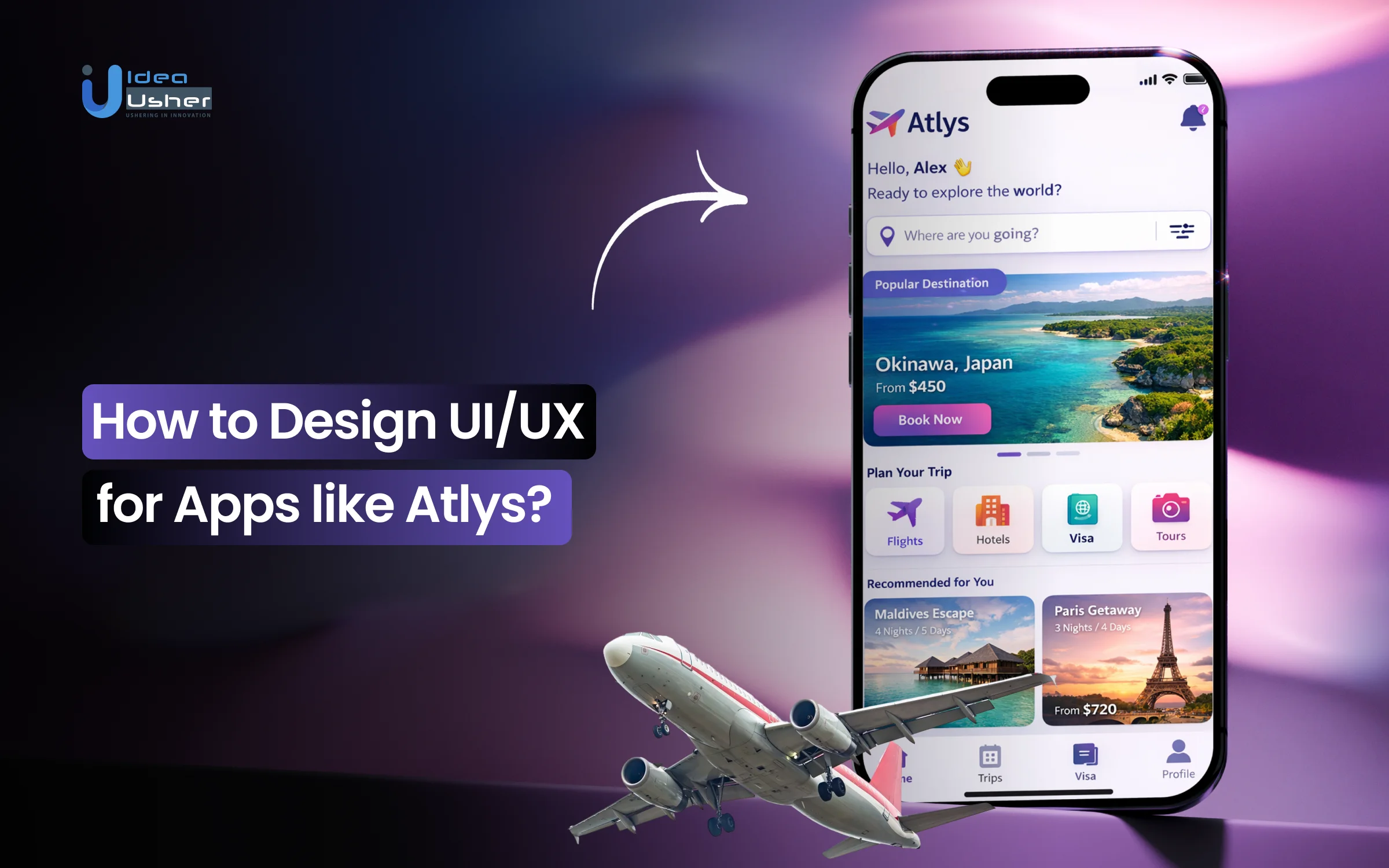
Atlys excels here. Its minimalist interface allows users to scan passports and take compliant photos in seconds. It turns a week-long bureaucratic process into a brief mobile interaction.
Solving Outdated Visa Processes
Legacy visa systems are defined by redundancy. Applicants provide identical data across multiple forms and endure “black hole” waiting periods. This inefficiency costs travelers time and host countries’ revenue.
Building a platform that validates data before it reaches government servers eliminates human error. Solving this frustration requires an intermediary layer that acts as a sophisticated filter.
iVisa handles this through “guided flows.” By breaking complex forms into logical steps with 24/7 review, they offer the transparency that official portals lack.
Growing Trust In AI
The barrier to using AI for legal documentation has collapsed. Machine Learning and OCR are now more reliable than manual entry. AI can instantly verify passport authenticity and ensure documents meet strict specifications.
- Automated Verification: AI flags inconsistencies before submission to reduce rejection risks.
- Predictive Analytics: Platforms predict processing times based on historical data.
- Scalability: AI-driven models handle 10,000 applications as easily as ten, protecting profit margins.
Sherpa demonstrates this by integrating into airline checkout flows. Their UI identifies visa needs based on destination and citizenship in real-time. This “invisible” UX solves problems before the user notices them.
Startup Opportunities In Travel-Tech
The “moat” in travel-tech is integration. The market remains fragmented with niche agencies. There is a massive opportunity to build a global “Visa Gateway” that aggregates government APIs into one interface.
Monetization extends beyond service fees. A dominant platform sits at the top of the travel funnel. This allows for high-margin upsells like travel insurance, SIM cards, and relocation packages. Investing in visa automation is about owning the gateway to global mobility.
Why UX Is the Make-or-Break Factor in Visa Apps?
In international travel, the user experience of visa apps is the primary filter for customer acquisition. A platform can have advanced backend integrations, but a poor frontend design will cause users to pivot to competitors.
The goal is to transform a legal requirement into a frictionless transaction. High-level UX serves as a risk-mitigation tool. It ensures data accuracy at the source, directly increasing approval rates and lowering support overhead.
1. Portal Drop-Off Points
Traditional portals suffer from design failures that lead to massive churn. Drop-offs often occur during document uploads or payments. When a portal fails to specify file formats or rejects a payment without a clear message, user trust evaporates.
Apps like Atlys solve this by using mobile-native features to handle document capture instantly.
By replacing manual uploads with a specialized camera interface that auto-crops and verifies passport photos, they eliminate the primary technical friction point where most legacy users quit.
2. Solving Document Flow Fatigue
Abandonment is usually a response to form fatigue. When a user sees a long page of complex questions, the perceived effort exceeds the service value. This is especially true for digital natives who expect a one-tap experience.
Strategic design solves this through progressive disclosure. Instead of overwhelming the user, the app reveals information only as needed. This keeps the user in a flow state, making the legal process feel manageable and transparent.
3. UX As A Revenue Driver
In travel-tech, superior UX translates directly to the bottom line. It increases the Lifetime Value of a user. A seamless experience builds brand loyalty that is difficult for legacy agencies to breach.
iVisa demonstrates this by offering a concierge feel through its interface. By simplifying complex government jargon into plain language and providing clear progress bars, they drive higher completion rates. This efficiency turns a one-time user into a repeat customer for every future trip.
- Conversion Optimization: Reducing completion time by 20% leads to a significant spike in revenue.
- Lower Support Costs: Intuitive design prevents common mistakes, reducing the volume of support tickets.
- Referral Loops: A visa app that works becomes a viral recommendation within business communities.
4. Modern Traveler Expectations
Today’s travelers operate on a mobile-first philosophy. They expect the same polish from a visa app as they do from premium banking platforms. This includes biometric login, push notifications, and integrated document scanning.
A modern platform must act as a digital concierge. It should store frequently used documents securely and provide one-click renewals. For an investor, the most valuable platform becomes the permanent digital home for a traveler’s international identity.
What Makes Atlys Stand Out In UX Design?
Success in the visa tech sector depends on hiding complexity within visa apps. Atlys is a benchmark for investors because it treats the visa process as a product challenge rather than a legal one. It turns high-friction government requirements into a seamless mobile workflow.
For entrepreneurs, the value lies in the abstraction layer. This technology sits between the user and the bureaucracy. It ensures the applicant never deals with the messy backend of a government portal.
1. Simplifying Requirements
The primary feat of Atlys is unified data intake. The app uses Standardized Form Fields instead of forcing users to learn country-specific nuances. Users scan their passport once, and the app maps that data to various national requirements.
This creates a massive competitive moat. Once documents are in the ecosystem, switching costs for the traveler become too high. For an investor, this means high retention and lower long-term acquisition costs.
2. Turning Paperwork Into Interactions
Atlys replaces static forms with Progressive Disclosure prompts. Using OCR and AI, the app pre-fills 90% of applications. This reduces submission time from hours to minutes, lowering the cognitive load that leads to abandonment.
- Smart Photo Compliance: A Modal Camera Interface auto-crops and adjusts lighting to meet embassy standards.
- Microcopy Clarity: Conversational UI translates complex legal questions into simple prompts.
- Inline Validation: Real-time error flagging prevents the anxiety of traditional submission methods.
3. Real-Time Status Tracking
Traditional visa applications are a black box. Atlys addresses this with a granular Timeline Component. Users receive push notifications at every stage, from verification to embassy submission and final issuance.
This transparency builds psychological safety. When travelers use Real-time Status Indicators, they rarely contact support. This allows a small team to scale and handle thousands of concurrent applications efficiently.
4. Trust Via “Pay When On Time”
Atlys uses a disruptive refund model as a trust signal. By promising a 100% refund for delays, the platform uses a Risk-Reversal Pattern. This aligns financial incentives with the user’s need for certainty.
This moves the app from a utility to a guarantor. For an entrepreneur, this is a masterclass in Persuasive Design. It removes the fear of losing money, making the platform the default choice for high-stakes travel.
Core UX Principles Behind High-Converting Visa Apps
In international travel, the user experience of visa apps is the primary filter for customer acquisition. For an investor, the interface is the product. A platform can have advanced backend integrations, but a poor frontend design will cause users to pivot to competitors.
High-level UX serves as a risk-mitigation tool. It ensures data accuracy at the source, directly increasing approval rates and lowering support overhead.
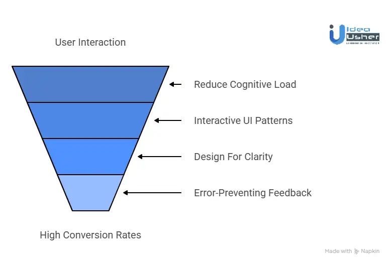
1. Reducing Cognitive Load
High-converting apps avoid the “wall of questions” common in legacy systems. Instead, they use a segmented approach that presents one data point at a time. This strategy prevents decision fatigue and keeps the user moving forward.
Boundless uses this principle effectively for complex immigration paths, breaking daunting legal requirements into digestible, sequential milestones. This flow is essential for mobile users to reduce abandonment rates.
2. Interactive UI Patterns
The most successful platforms move beyond the traditional text box. They use interactive patterns that make data entry feel like a guided conversation. Automated scanning and visual selection tools eliminate the need for tedious typing.
- Contextual Inputs: Show only fields relevant to the user’s specific citizenship.
- Visual Guides: Use icons to explain which part of a document needs to be scanned.
- Frictionless Navigation: Ensure users move through the process without losing data.
Offvisa leverages this by replacing dense government questionnaires with a sleek, interactive interface that feels like a modern survey rather than a legal filing.
3. Designing For Clarity
A common mistake in visa tech is showing everything at once. High-converting UX prioritizes clarity by hiding technical details until they are required. The interface focuses on the immediate task while providing a sense of overall progress.
This clean approach reduces anxiety. Entriva embodies this by offering a high-clarity dashboard that strips away bureaucratic noise, focusing strictly on the traveler’s next required action.
4. Error-Preventing Feedback
In the visa world, a single typo can lead to a rejection. High-converting apps build defensive UX layers that provide instant feedback. These loops catch mistakes at the point of entry rather than after the user has paid.
Identifying an expired passport or incompatible file format in real-time saves the user from future frustration. For the platform owner, these feedback loops act as an automated quality control department, ensuring applications are optimized for approval.
How to Design UI/UX for Apps like Atlys?
Designing UI and UX for a visa app starts with a guided flow that can clearly reduce confusion at each step. The interface should gradually validate inputs in real time and may prevent errors before they reach submission. A clean system can quietly combine OCR and structured forms so users can complete applications with minimal effort.
We have designed UI and UX for several AI driven visa apps like Atlys, and this is how we approach these experiences.
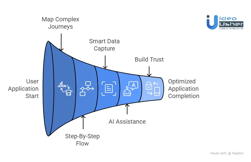
1. Mapping Complex Journeys
We start by mapping the “Happy Path” for every citizenship-to-destination combination. By identifying potential friction points from document types to embassy quirks, we build personalized logic into the flow. This ensures users only see what is strictly relevant to them, eliminating the dead ends found in legacy portals.
2. Step-By-Step Flow Structure
We utilize a chunking strategy to maintain high completion rates. By breaking the application into logical, bite-sized stages, we prevent the decision fatigue that kills conversions. Our designs lead users through biometrics, travel history, and payments in a way that feels as effortless as a modern fintech signup.
3. Smart Data Capture UX
We eliminate manual entry by integrating advanced OCR (Optical Character Recognition). We design a mobile-first interface where users simply point their camera at a passport to populate 90% of the form instantly. This zero-type philosophy speeds up the process and virtually removes the human error that leads to visa rejections.
4. AI Without Overload
Our approach to AI is invisible assistance. We build real-time background checks that analyze uploaded photos for head tilt, lighting, and background compliance before the user even clicks submit. By providing instant pass/fail feedback, we give users the confidence of an expert review without the wait times of a manual agency.
5. Trust Across Touchpoints
In the visa industry, trust is the primary currency. We weave explicit trust signals throughout the UI, from bank-grade encryption badges to real-time verification checkmarks. We ensure that every screen, from the initial scan to the final payment, reinforces the security and professional standing of your brand.
6. Speed And Completion Optimization
We treat performance as a core UX feature. Our designs prioritize low-latency transitions and immediate visual feedback to create a sense of momentum. By using progress indicators and success animations, we keep users engaged until the very end, ensuring your conversion funnel remains leak-proof and highly profitable.
Cost to Design UI/UX for Visa Apps like Atlys
Determining the design budget for high-performance visa apps requires balancing visual polish with complex logic. For our clients, we view design as a capital investment. A well-designed interface doesn’t just look good; it reduces the cost of customer acquisition and minimizes the manual support required to fix user errors.
MVP Vs. Full Product UX
The cost of an initial MVP focus is on the “Happy Path,” which is the most common travel route. A full-scale product design must account for edge cases, multi-country logic, and complex document types.
| Phase | Estimated Design Cost | Key Deliverables |
| MVP Design | $15,000 – $25,000 | Core flow, basic brand kit, high-fidelity wireframes. |
| Full Product | $40,000 – $80,000+ | Full design system, edge-case states, multi-platform UI. |
Pro Tip: Investing in a robust Design System during the MVP phase saves roughly 30% on future iteration costs by creating reusable components.
Budgeting For AI-Driven UX
When we integrate AI, the design cost shifts from “pixels” to “feedback loops.” Designing for AI, like photo verification, requires specialized UI to handle machine learning outputs such as “blur detected” or “lighting too dark.”
- Logic Mapping: $5,000 – $10,000 for defining AI-user interactions.
- Custom UI Components: $3,000 – $7,000 for real-time validation states.
- Total AI-UX Layer: Expect an additional $10,000 – $20,000 for a seamless, automated feel.
Feature Depth And Cost
The more “intelligent” the app, the higher the design overhead. If the app only handles one visa type, the flow is linear. If it handles 100+ countries, the UI must be dynamic.
- Dynamic Form Generation: Designing a UI that changes based on user citizenship adds significant complexity.
- Document Management Vaults: Creating secure, intuitive places for users to store passports and photos requires high-level UX architecture.
- Third-Party Integrations: Designing the hand-off between your app and payment gateways or government APIs requires detailed state-mapping.
Hidden Costs In Scaling
Scaling a visa app reveals “UX debt.” As you add more countries, the original design might break. Budgeting for iteration is vital for long-term success.
- Usability Testing: Budget $5,000 per quarter to watch real users struggle with new country requirements.
- Localization: Designing for right-to-left languages or specific regional aesthetics can add 15% to your total design budget.
- Accessibility (WCAG): Ensuring your app is usable for everyone isn’t just ethical; it’s often a legal requirement in travel-tech, costing about $4,000 – $8,000 for a full audit and fix.
Designing a Frictionless Visa Application Flow
Building high-conversion visa apps means optimizing every micro-moment of the journey. The application flow acts as a funnel where every second of delay represents a potential drop-off. By focusing on a “mobile-first, friction-last” philosophy, the design ensures users move from initial interest to final payment in under five minutes.
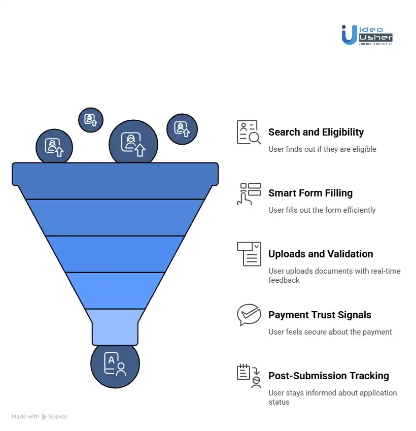
1. Entry: Search And Eligibility
The first interaction is the most critical. Complex research is replaced with a simple, high-impact interface that provides instant answers.
- Smart Search: A dual-input component asking “Where are you from?” and “Where are you going?”
- Instant Result: Instead of a list of rules, the user sees a clear “Eligible for e-Visa” card with price and processing time.
- Primary CTA: A single, prominent button to “Start Application” that initiates the session without requiring an account first.
2. Smart Form Filling
Traditional data entry is replaced by intelligent UI patterns that anticipate user needs.
Core Logic: If a user types more than ten words, the UX has missed an optimization. Using Google Places API for address lookups and predictive text for nationality fields minimizes effort. Radio buttons and segmented controls replace long dropdown menus to reduce the physical taps required.
3. Uploads And Validation
This is where most users quit. The solution is turning the mobile camera into a professional scanner with real-time feedback.
When a user captures a photo, the UI provides immediate analysis. If the passport scan is blurry or the selfie has poor lighting, the app flags it before the upload finishes. This real-time validation prevents the rejection loop found in government portals, ensuring the user feels successful at every step.
4. Payment Trust Signals
In the final stage, the design focuses on psychological safety to ensure the user completes the transaction.
- Fee Transparency: A clear table showing Government Fees versus Service Fees.
- Security Badges: Visible “PCI-DSS Compliant” and “Secure Encryption” icons near the payment button.
- Risk Reversal: A bold “100% Refund if Rejected” statement placed directly above the payment trigger.
5. Post-Submission Tracking
The journey continues after payment. The design must manage the “anxiety phase” that follows submission through constant communication.
- Visual Timeline: A progress bar showing exactly where the application sits (e.g., “Reviewing,” “At Embassy,” “Approved”).
- Proactive Alerts: Push notifications so the user never has to manually check for updates.
- Digital Vault: A secure area where the final PDF visa is stored for instant download or sharing.
How AI Enhances UX in Visa Apps Like Atlys?
In visa automation apps, AI is the engine that transforms a bureaucratic hurdle into a 60-second task. For investors and developers, AI is not just a buzzword; it is a critical UX layer that removes the “human error” variable. By automating data entry and validation, the platform shifts from being a passive form to an active assistant.
1. AI-Powered Scanning And OCR
Manual data entry is the primary cause of user churn. High-performance platforms like iVisa integrate Optical Character Recognition to extract data from passports and IDs instantly.
- Speed: Data fields populate in milliseconds after a scan.
- Accuracy: Eliminates typos in passport numbers or expiration dates.
- UX Win: The user simply points and shoots instead of typing on a small mobile keyboard.
2. Real-Time Photo Validation
Embassy rejections often stem from poor-quality photos. AI-driven vision models analyze selfies and passport crops the moment they are captured.
Instant Feedback: If the background is too dark or the user’s head is tilted, the UI displays a real-time warning. Sherpa° uses this technology to guide users through the specific photo dimensions required for different destinations, ensuring the user never submits a non-compliant document.
3. Eligibility Prediction
AI can analyze a traveler’s profile against thousands of shifting immigration rules to predict approval odds.
- Risk Profiling: Comparing user data against historical embassy approval trends.
- Smart Filtering: Only showing visa types the user is statistically likely to receive.
- Transparency: Providing an “Approval Probability” score to build confidence before payment.
4. Personalized Visa Recommendations
Not every traveler knows which visa they need. Machine learning models suggest the optimal permit based on travel intent, duration, and past history.
VisaHQ leverages this by cross-referencing user profiles with destination policies. If a user frequently travels for business, the app proactively suggests multi-entry options over single-entry tourist visas, increasing the average order value.
5. Proactive Error Detection
Before the final submit button becomes active, a “Self-Healing” logic layer scans the entire application.
- Logic Checks: Detecting if a return date is set before the departure date.
- Format Verification: Ensuring phone numbers and addresses match the destination country’s expected syntax.
- Result: This final AI sweep acts as a safety net, drastically reducing the operational cost of manual application reviews.
Gamification Tactics That Improve Completion Rates
In visa apps, gamification uses behavioral psychology to transform stressful legal filings into manageable missions. By replacing “forms” with “milestones,” platforms drive higher completion rates and user satisfaction.
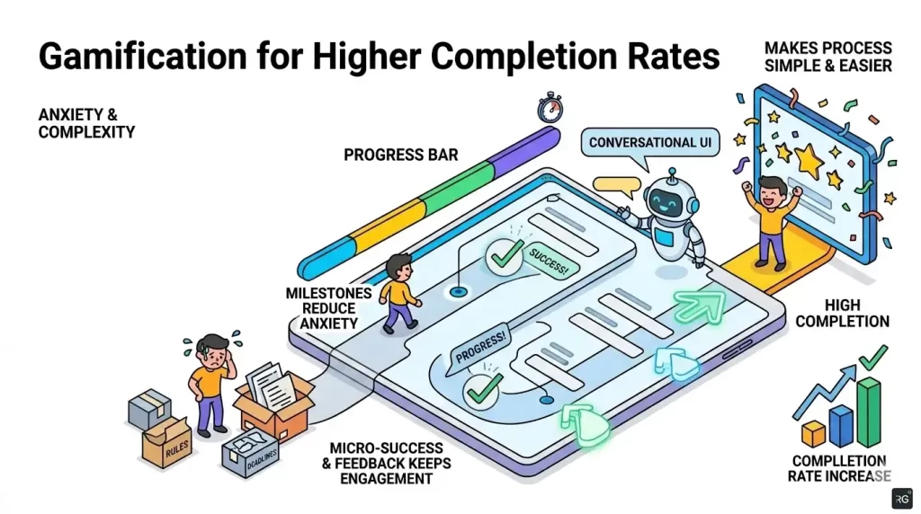
1. Progress Indicators
A visual progress bar serves as a psychological anchor, removing the anxiety of the unknown.
- Sectional Chunking: Grouping 50+ fields into five clear milestones like “Identity” and “Travel.”
- Time Labels: Marking steps as “Takes 2 minutes” to manage expectations.
- Goal-Gradient Effect: Increasing visual momentum as the user nears the finish line.
2. Micro-Success States
Long-form entry feels like a chore until punctuated by small wins.
Visual Reward: Completing a section triggers a subtle success animation, such as a green checkmark or haptic pulse. These micro-interactions provide a dopamine hit that keeps the user engaged through tedious data entry.
3. Visual Cues
Strategic hierarchy directs the user’s attention toward the “Next Best Action.”
- Ghost States: Showing upcoming steps to create a clear roadmap.
- Smart Highlighting: Pulsing icons for required documents or priority fields.
- Contextual Tooltips: Brief bubbles explaining why specific info is needed.
4. Approaching Serious Processes
Using “Calm UI” principles, designs replace bureaucratic jargon with conversational prompts to lower defensive barriers.
| Traditional UI | Gamified UI |
| Field: Place of Birth | Prompt: Where were you born? |
| Button: Submit Form | Button: Send to Embassy |
| Error: Invalid Format | Fix: Check your passport number. |
Humanizing the language makes the process feel like a guided journey rather than a solo struggle against a government portal.
Common UX Mistakes in Visa App Development
Building high-performance visa apps requires avoiding the structural flaws that typically plague government portals. Many developers prioritize backend logic over the user journey, resulting in high churn rates and frustrated travelers.
At IdeaUsher, we audit these common failure points to ensure our clients launch products that capture and retain global users.
1. Overloading Users Upfront
One of the biggest mistakes in visa tech is the “Wall of Text” approach. Forcing a traveler to read through 50+ eligibility rules and document requirements before they even start the application triggers immediate decision fatigue.
Our Solution:
We implement Progressive Disclosure. Our designs hide non-essential details until they are contextually relevant. By using a “Just-in-Time” information architecture, we ensure the user only sees the data required for their specific step, significantly increasing completion rates.
2. Poor Error Validation
Generic error messages like “Invalid Input” or “Form Error” are conversion killers. If a user spends twenty minutes filling a form only to have it rejected upon submission without a clear explanation, they will likely abandon the platform.
Our Solution:
We build Inline Validation into every field. Our UI flags errors the moment they occur, providing clear, human-readable instructions on how to fix them. We also integrate real-time data masking and format checks to prevent typos from ever reaching the “Submit” phase.
3. Lack Of Status Updates
The period between payment and visa issuance is defined by high user anxiety. Many apps leave users in the dark, forcing them to manually check their email or log in repeatedly to see if there has been progress.
Our Solution:
We design a Proactive Communication Layer. This includes a dynamic, visual timeline within the app and automated push notifications. We ensure the user is alerted at every milestone, from “Embassy Received” to “Visa Issued,” providing the psychological safety that builds long-term brand loyalty.
4. Ignoring Mobile-First Design
Most travelers manage their documents on the go. Apps that are simply “shrunk-down” versions of desktop websites fail because they don’t account for touch targets, camera stability, or limited screen real estate for complex data tables.
Our Solution:
We prioritize a Native Mobile-First Framework. Our designs include oversized touch targets, thumb-friendly navigation, and deep integration with mobile hardware for document scanning. By optimizing for the mobile environment, we allow your clients to complete their entire application from a smartphone in a single sitting.
Designing a Reusable Travel Profile System in Visa Apps
A core differentiator for high-end visa apps is the shift from a “one-off form” to a persistent “traveler profile.” By creating a secure digital vault for a traveler’s data, the platform transforms from a utility into a long-term asset. This architecture minimizes data entry, increases user retention, and positions the app as the primary gateway for all future international trips.
1. Storing And Reusing User Data
The interface is designed to capture data once and deploy it infinitely. Instead of asking for a passport number every time, the system pulls encrypted data from a central repository.
- One-Click Retrieval: After the initial scan, passport details, digital photos, and previous addresses are automatically fetched for new applications.
- Security Visualization: Clear “Encrypted Vault” icons reassure users that their sensitive biological data is stored safely.
- Expiry Alerts: The UI proactively notifies users when a stored document, such as a passport or medical certificate, is nearing its expiration date.
2. Reducing Repeat Friction
For a frequent traveler, the goal is to reduce the application time from minutes to seconds. This is achieved through a “Verification, Not Entry” UX strategy.
The Flow: When a returning user selects a new destination, the app presents a pre-filled summary. The user simply scans through the data and taps “Confirm and Continue” rather than typing. This “Lazy UX” approach drastically increases the Lifetime Value of each customer.
3. Personalization via Past Behavior
By analyzing a traveler’s history, the interface adapts to their specific needs. If a user frequently applies for business visas to the Schengen Area, the dashboard prioritizes similar business-entry options and highlights relevant policy changes in real-time.
- Smart Suggestions: Recommending multi-entry visas based on the frequency of past trips.
- Tailored Checklists: Adjusting document requirements based on what the user has successfully submitted in previous cycles.
- Adaptive Language: Using terminology that aligns with the traveler’s frequent destinations.
4. Syncing Across Multiple Destinations
When a traveler plans a multi-country tour, the “Profile System” acts as a central hub. Data provided for a French visa is automatically mapped to the requirements for a German or Italian application within the same trip.
| Feature | User Impact | Business Value |
| Cross-Pollination | Enter data once for 5 countries. | 80% faster checkout. |
| Unified Dashboard | See all active visas in one view. | Reduced support tickets. |
| Instant Updates | Change an address once; it updates everywhere. | 0% data mismatch errors. |
Why Choose IdeaUsher for Visa Apps?
IdeaUsher can help you build the next generation of travel technology by merging elite engineering with an intuitive, user-centric approach. With over 500,000 hours of coding experience, our team of ex-MAANG/FAANG developers ensures your platform is both functional and market-leading. We understand that in the visa industry, success is measured in milliseconds and micro-interactions.
Travel-Tech Experience
IdeaUsher can help you build a robust infrastructure by leveraging our deep background in travel-tech. We navigate complex API integrations with government portals and aggregators, ensuring your app stays fast and compliant. Our expertise allows us to design logic that anticipates user needs before they even arise.
AI-Powered UX Expertise
IdeaUsher can help you build an intelligent interface that reduces human error through advanced AI. We specialize in high-speed OCR for document scanning and real-time computer vision for photo compliance. These invisible AI layers transform tedious data entry into a seamless, automated experience that rivals top-tier apps.
End-To-End Development
IdeaUsher can help you build a cohesive product journey from initial wireframing to final deployment. Our designers and engineers work side-by-side to ensure every visual element is technically optimized. We handle everything from secure payment gateways to complex backend architectures under one roof.
Global Track Record
IdeaUsher can help you build a world-class reputation by drawing on our history of success with international partners. We have helped startups and enterprises launch scalable platforms that handle millions of data points across diverse jurisdictions. Our perspective ensures your app is localized and ready for the global market.
Conclusion
Designing a visa app like Atlys requires a shift from passive data collection to active journey management. By combining invisible AI, predictive UI, and a mobile-first architecture, the complexity of global travel is reduced to a few simple taps. Success in this space isn’t just about a clean interface; it’s about building a high-trust, friction-free engine that turns every application into a seamless success story for the traveler.
FAQs
A1: Designing for visa tech requires a “friction-last” approach that prioritizes mobile-first entry and real-time validation. The core focus is to automate document scanning via OCR and provide instant feedback on photo quality. By using progressive disclosure, the design prevents information overload and builds the trust necessary for users to share sensitive data.
A2: Also known as the Pareto Principle, this rule suggests that 80% of a user’s goals are achieved through only 20% of a product’s features. Designers identify critical paths, such as “Start Application” or “Upload Passport,” and make them prominent in the visual hierarchy. Perfecting the 20% of the interface that users interact with most drastically improves overall efficiency.
A3: The UX process is divided into Discovery (researching needs), Definition (mapping flows), Design (building wireframes), and Testing (validating with real users). This cycle ensures the final product is rooted in data rather than assumptions. Each stage serves as a filter to remove usability issues before any code is written.
A4: The four primary interaction types are Graphical User Interfaces using icons and menus, Command Line Interfaces involving text-based inputs, Menu-Driven Interfaces often seen in kiosks, and Voice User Interfaces like Siri. Modern visa apps mainly leverage GUIs for accessibility while incorporating gestures to make document scanning feel natural on mobile devices.